Enabling easier and transparent budget reporting


Overview
Give.do helps NGOs by connecting them to corporates and help them evaluate their social impact. Traditionally, account managers use emails to track budgets – a slow and non transparent system.
We solved this problem by introducing a dashboard to track, report and disburse budget to several organisations. As a consultant designer, I helped the team make the dashboard features easier to use and adopt to existing user behaviours. Currently in development, the impact of this feature would be:
A single source of truth for all the information
Highly transparent, anyone with access can look up relevant data
No more unnecessary follow ups by stakeholders to find information
My Contribution
Product design
User research
The Team
2 × Product designers
1 × Engineer
1 × Design head
Year
2024
Budget reporting at organizations has been done via email – a slow, non transparent system that does not have a single source of truth
Account managers struggle to track projects across numerous email threads, while stakeholders lack a clear view of budget use
Large organisations often adhere to outdated systems and workflows, which eventually bottleneck productivity and create issues later on. Tracking budgets via email might have worked initially with smaller projects and a smaller team, but as the scope grew larger it was difficult to keep up with all the information
GiveGrants was already working on a solution, and focused around 3 key tasks for project managers
Allocating funds for several years based on the company's profit
Mapping the funds to each project undertaken by NGOs
Tracking the disbursement & utilization of these funds every year
But it did not map well to the user’s mental model
The users were confused with the jargon heavy and visually complicated screens. Since they were already used to a certain workflow, a new approach was required.
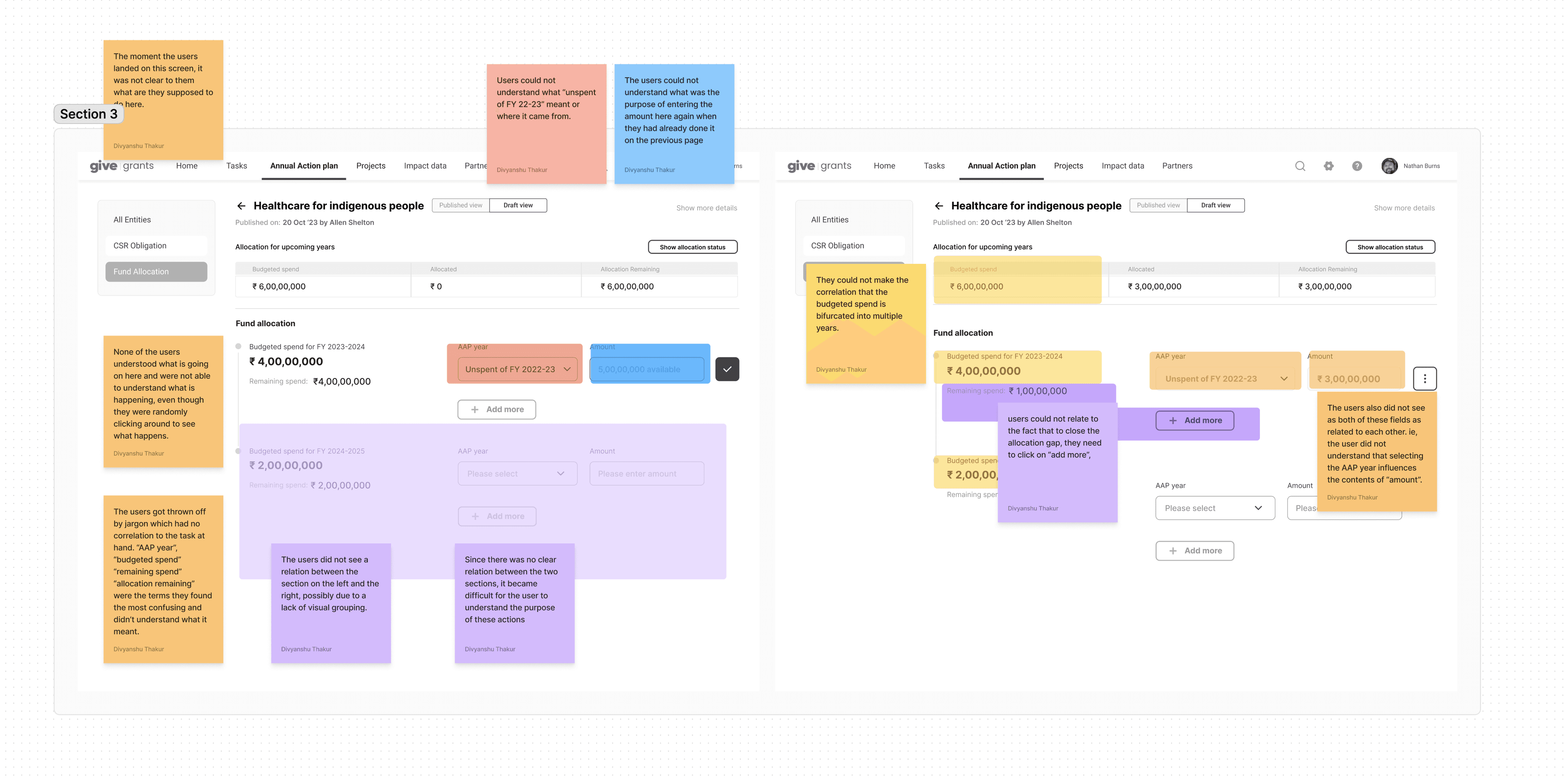
My first goal was to remove friction by user testing and learning where they get stuck
Before
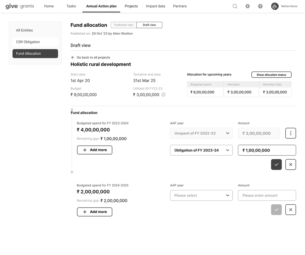
After
The second goal was to visually declutter information heavy screens
We played around with several interface options to get an idea of what we thought might work the best with our users, later validated by testing the prototypes.
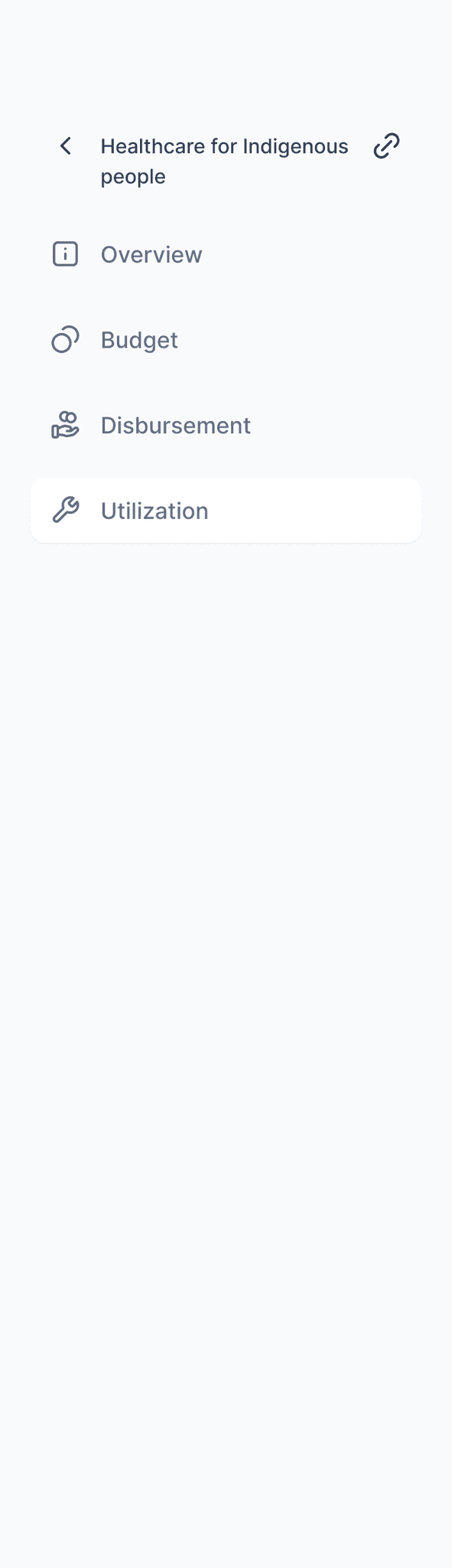
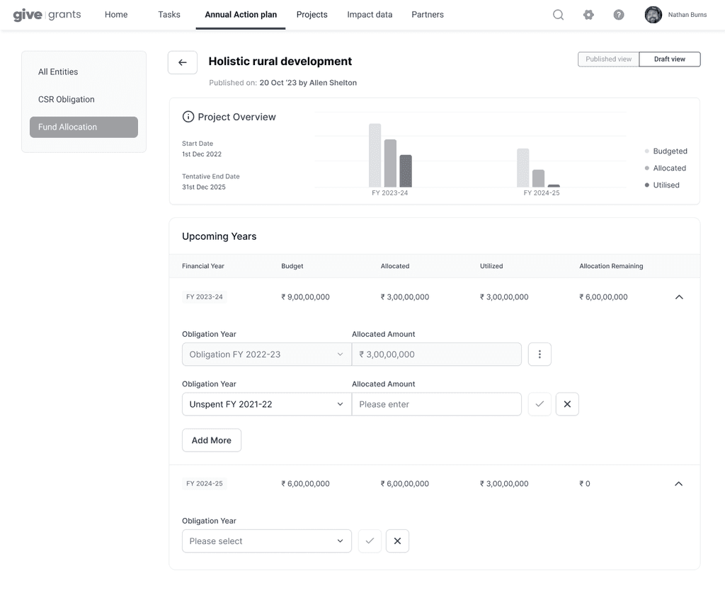
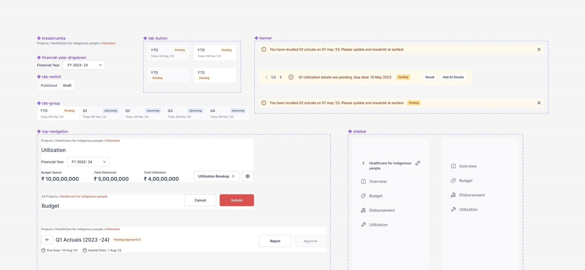
We divided the tasks on the dashboard under 'Projects'
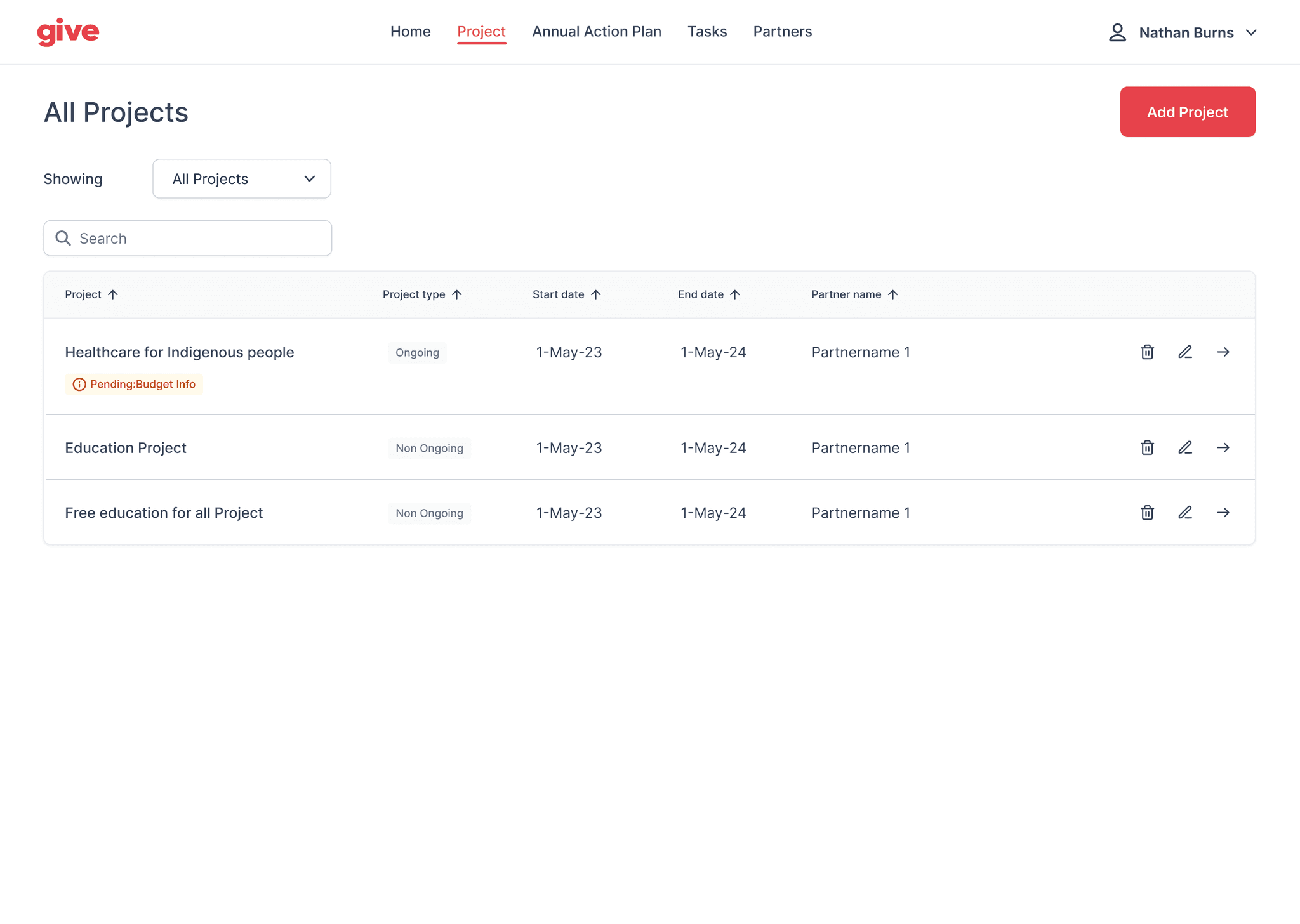
The project dashboard allows the user to see all projects at a glance and manage them
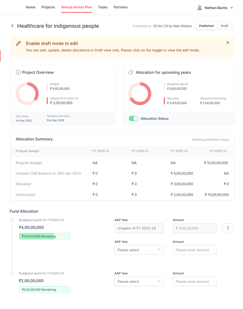
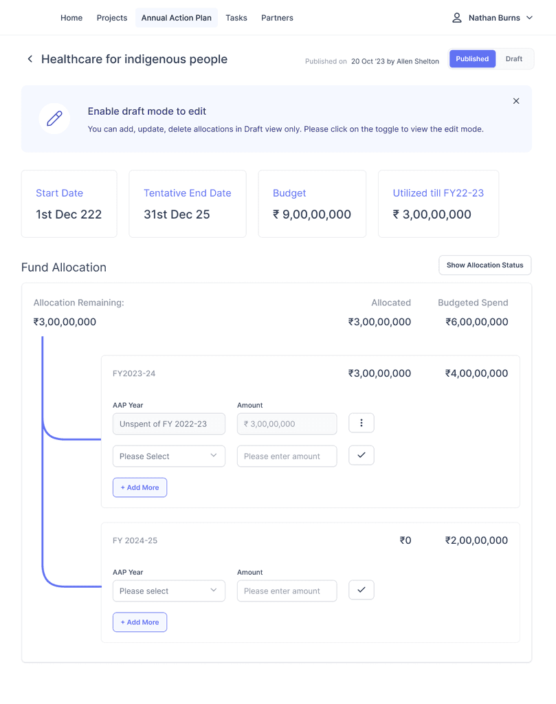
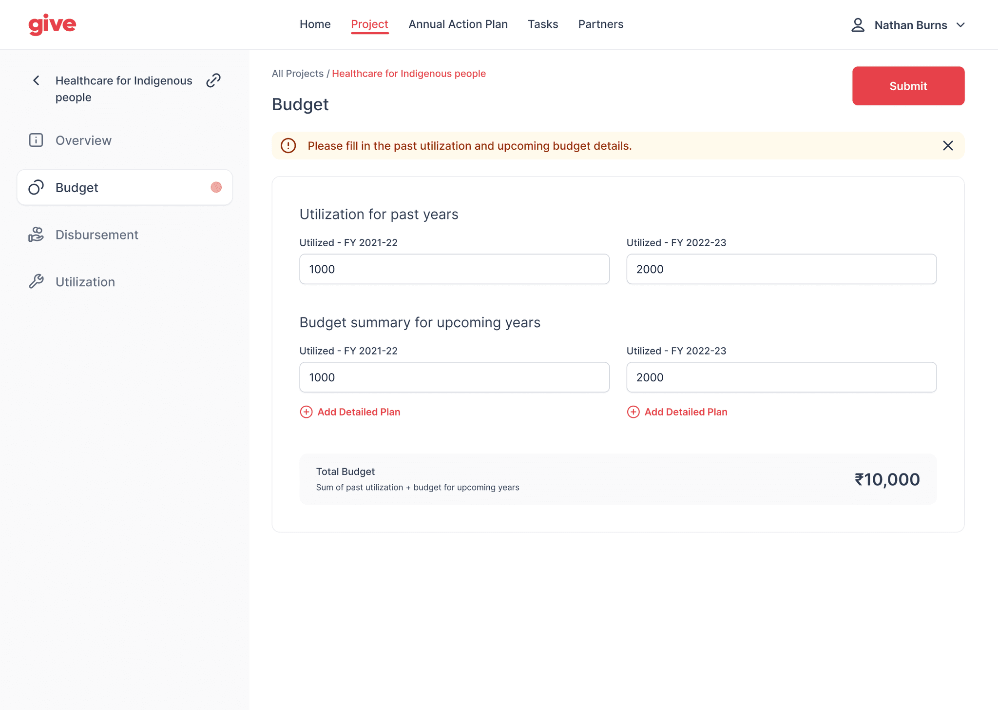
The user can set the budget for upcoming and previous years within a project
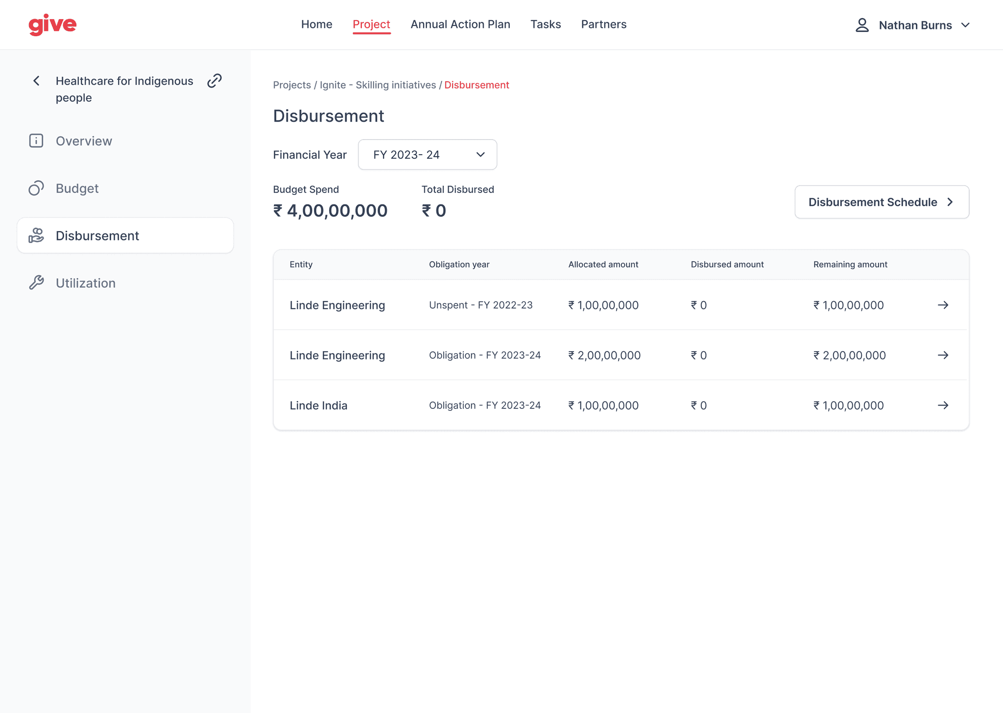
Next, they can add and disburse payments and update it here
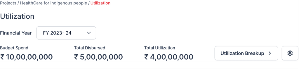
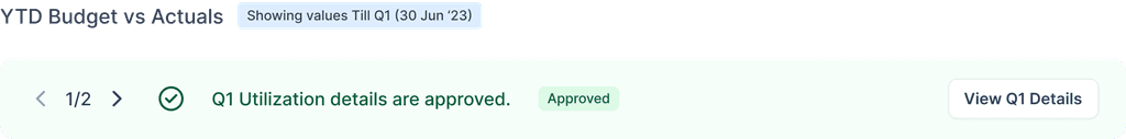
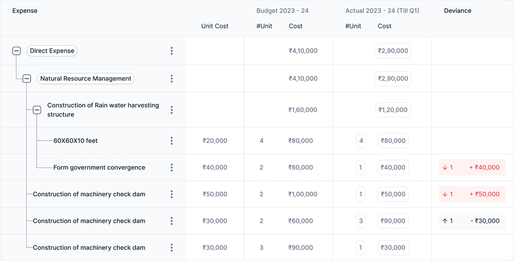
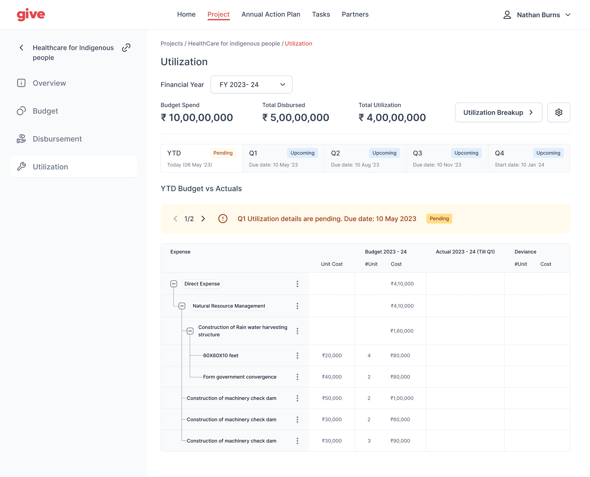
Utilization is where they enter the actual usage of funds, and add proof of usage
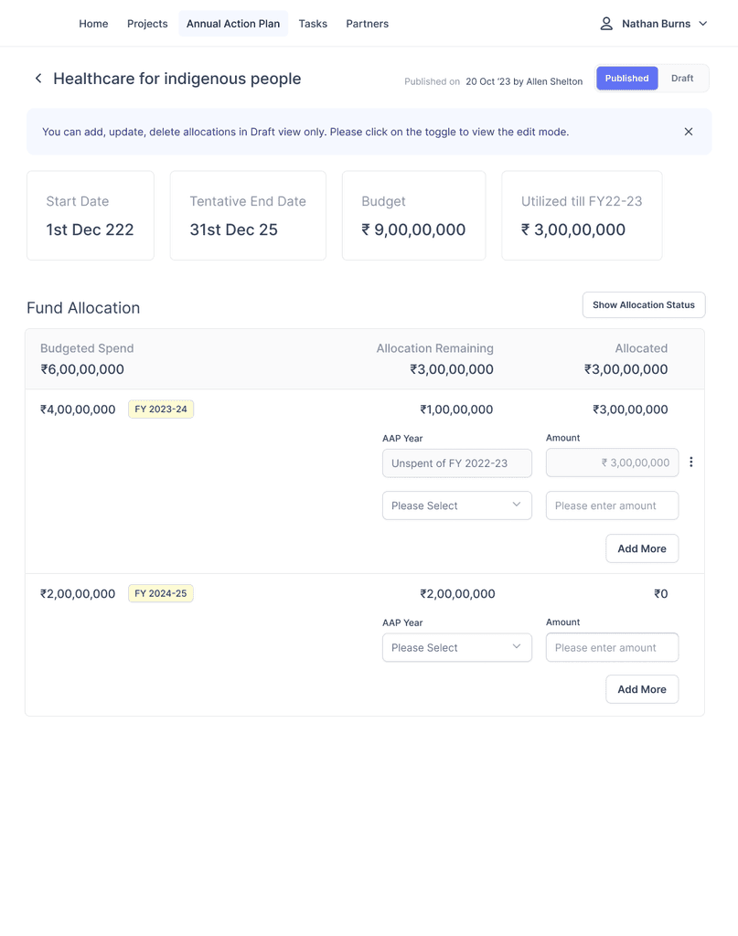
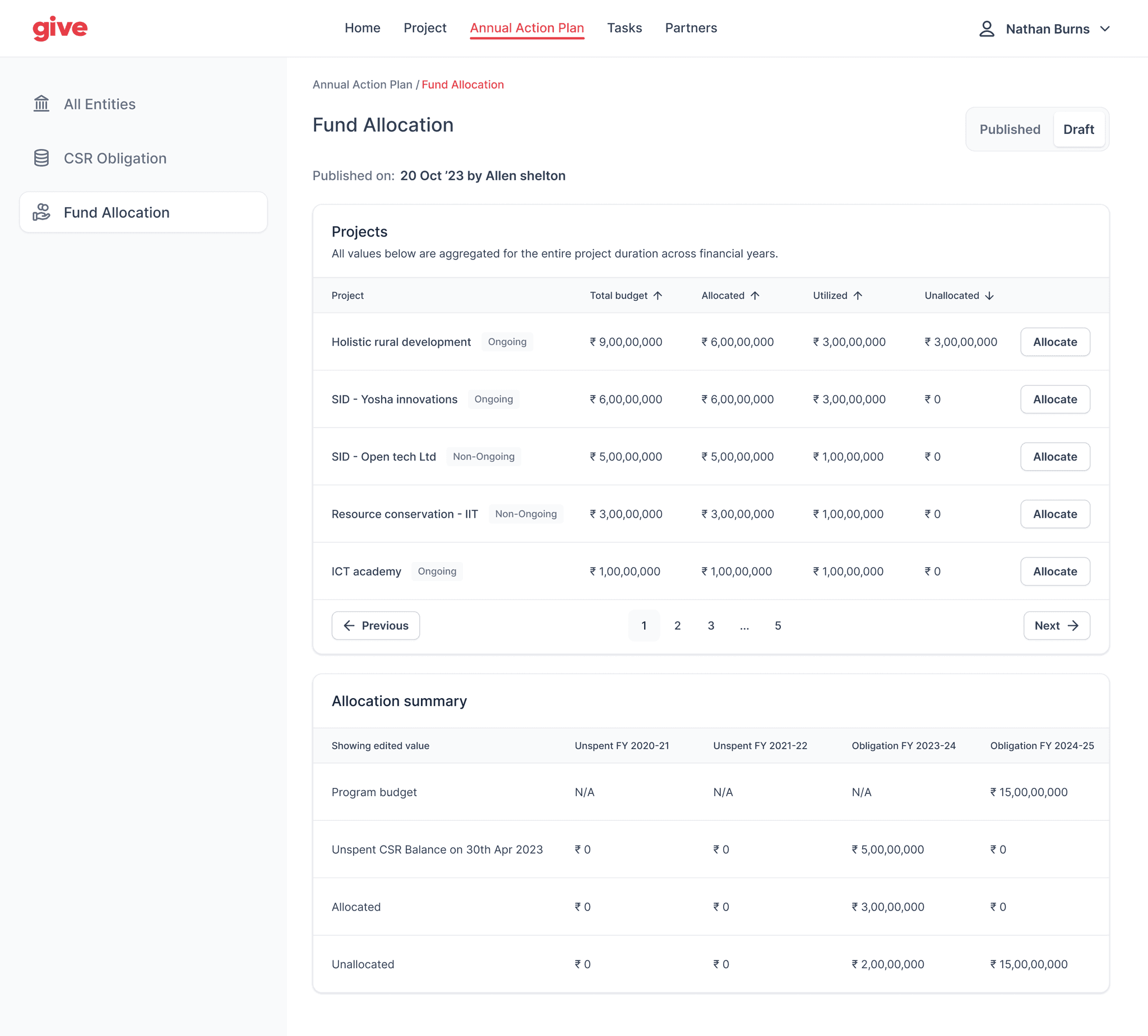
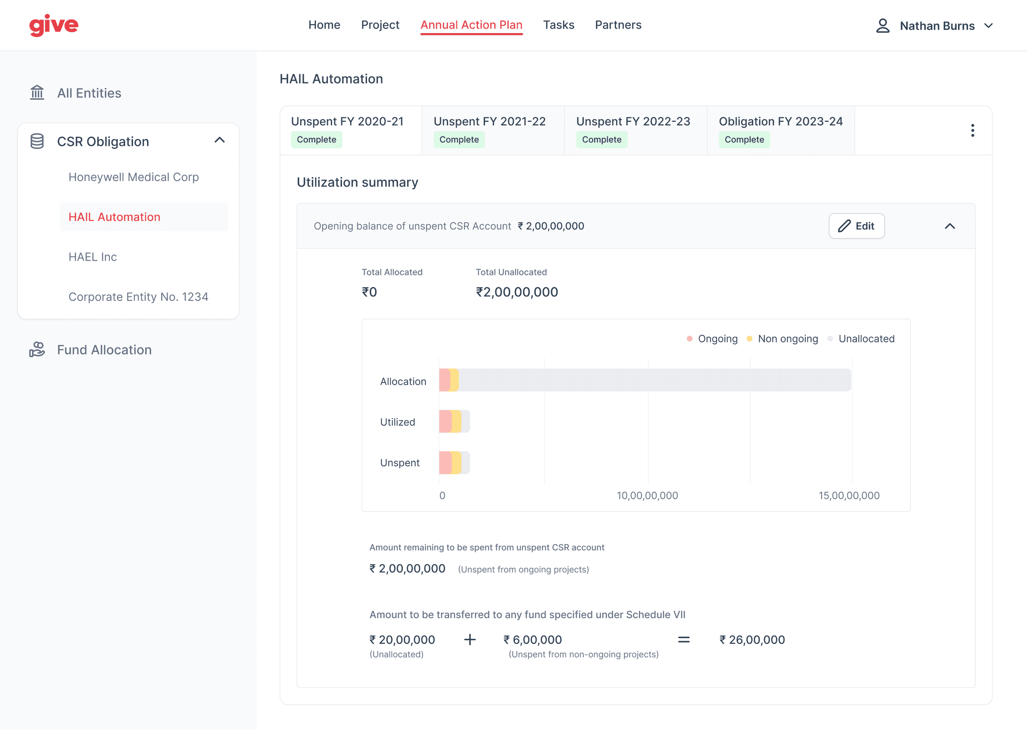
And for setting broader budget allocations, under 'Annual Action Plan'
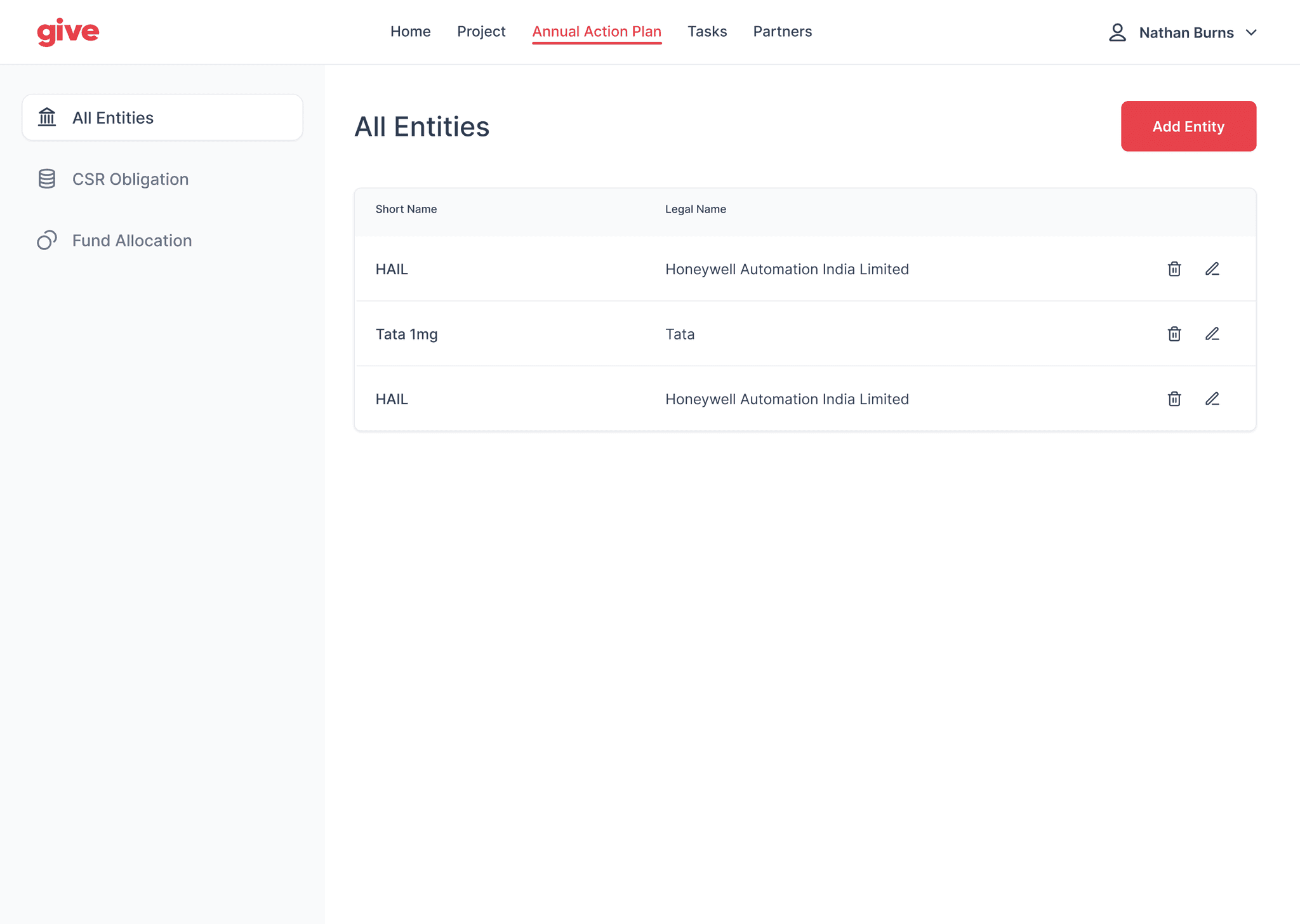
Entities are a list of subsidiaries of an organization
The obligation page is where the user can set the total budget for the current and consecutive years
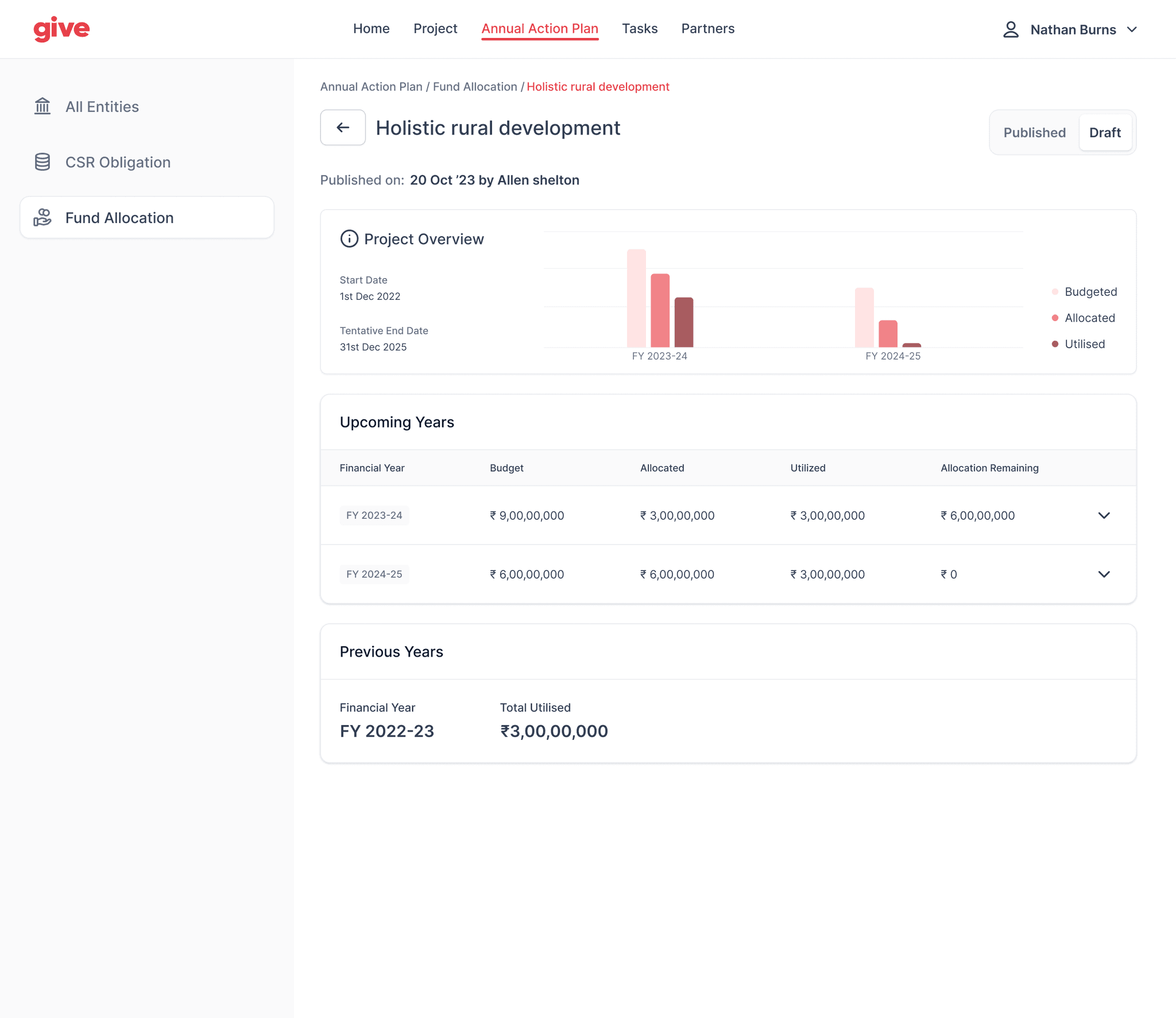
In the fund allocation tab, the user can assign funds to each project based on the yearly allocation
Within a project, the user can proceed to allocate funds
A modularised design system to speed up the design process
Since my role involved improving the design process as well, I took the opportunity to create a design system to speed up designing new interfaces, by focusing on repeating components and layouts.
Currently in development, the product will have a significant impact in how budget reporting is done
While the product is being developed, I would be keen on testing the success of the product. Some key metrics that I would like to track would be:
The impact on the day to day tasks related to budgeting for managers
KPIs: Task completion rate, decrease in turn around time for reporting, NPS
Future scope: how might the product impact other areas of a business?